


As part of CITY POOL's respectful foray into the world of branding we've been taking a look around. For ourselves and others we've made a little compendium as an entry point into the world of branding via some basic info about of the best know firms. We chose the following 13 firms: Arnell group, The Brand Union, Chermayeff & Geismar, Futurebrand, Interbrand, Landor, Lippincott, Minale Tattersfield, Sterling Brands, Saffron Consultants, Siegel+Gale, vsa Partners, Wolff Olins, and compared the basic facts of:
1. When they were started and by whom.
2. How many people they employ.
3. How many locations they have.
For each firm we also included a great sample identity, and a sample identity that we feel is not so great. Some interesting realizations that came about while researching:
>A sizable proportion of firm founders came to USA from London.
>Most firms are headquartered in New York.
>Most, but not all, companies were started by one or two guys who have since passed away, or left the firm, often times leaving after the firms were purchased by the Omnicom's of the world. That's not to suggest that the firms aren't still doing good work, but we do find it interesting that the leaders who built the firms and good reputations over multiple decades aren't around anymore.
View and Download the PDF here, in the PDF the firm logos link to there respectful sites,
and there are some Easter egg links in there as well.

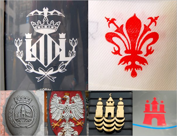 There are many things to be jealous about when it comes to Europe. One thing I'm jealous of are the awesome symbols most European cites have. Many have been adapted from coat of arms to become simplified icons, while others retain and older feel. Many also have back stories such as Valencia's

 These sketches were for the electronic music label
 This graphic was for a City Pool canoe trip taken last summer. I never made it past cub scouts, but even I know you gotta be prepared and have a ski mask and glock handy.
 As logotypes go this one from ESPN is kind of complex, but a limited color pallet and the USA map made up of abstract squares saves it and makes it pretty cool. On air and where appropriate the squares are extruded to give it some nice depth, but when it's tiny and flat the squares still work, giving it a web-friendly pixel feel. I feel a lot sports related graphics are overdone, but I think a good balance has been struck here.
 This lovely little logo is for Octopus Books, I discovered it on a book entitled "Popular Chinese Cookery" from 1974. The company still exists in the form of the London based
